In the previous post, I showed you a straightforward way how to measure product features retention.
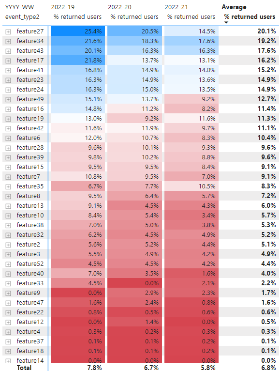
After applying the analysis we received the table with retention per feature like this (sorted by decreasing [Average % returned users]):
- On one hand, we received helpful information about which product features impact product retention the most.
- On the other hand, we don’t have at hand figures about how many users used these features so we can’t be confident that these figures are reliable.
Let’s add [# users] and consider this table one more time.
Now we can easily spot an issue: for example, the first two product features (feature27, feature34) with the highest [% returned users] have quite a modest volume in terms of [# users].
Actually, this problem is most common in a lot of analyses that I have seen. Often analyst brings a quite interesting quality measure but it is not backed up by quantity measure. As a result, some of our decisions can be at least suboptimal and at most just wrong.
So how can we fix this issue?
Let’s combine both metrics (qualitative and quantitative) into one chart. The most suitable way to do this is a scatter plot:
- let’s put on the X axis the metric [% users], it’s our quantity metric that measures the popularity of a product feature.
- let’s put on the Y axis the metric [% returned users], it’s our quality metric that measures the value of a product feature.
The resulting chart could look like this:
It seems that so far it’s rather hard to make any meaningful conclusions from the chart.
What can we do to improve the chart clarity?
Let’s apply the 50/80 percentile rule from the previous post.
Actually, after applying 2 thresholds for [% users] and [% returned users] we will get 9 clusters.
Clustered product features scatter plot could look like this:
By adding percentile thresholds to the chart we can now distinguish such product feature clusters:
- Core: [% users] > 80 pctl, [% returned users] > 80 pctl
- Power1: [% users] > 80 pctl, [% returned users] in [50, 80] pctl
- Power2: [% users] in [50, 80] pctl, [% returned users] > 80 pctl
- Casual1: [% users] in [50, 80] pctl, [% returned users] in [50, 80] pctl
- Casual2: [% users] in [50, 80] pctl, [% returned users] < 50 pctl
- Casual3: [% users] < 50 pctl, [% returned users] in [50, 80] pctl
- Set-up: [% users] > 80 pctl, [% returned users] < 50 pctl
- Niche: [% users] < 50 pctl, [% returned users] > 80 pctl
- Others: [% users] < 50 pctl, [% returned users] < 50 pctl
Let’s discuss a little bit each of clusters.
Core features are the real core of your product. These features are used by a lot of users, and what is more important users return back to continue using these features. As a rule, there could be a very small number of such features (2–3 features).
Power features are workhorses of your product. These features combined with core features deliver about 80% of the regular value that your product creates. Some of the power features (Power1) are as popular as core features but bring less value to users. Other power features (Power2) bring as much value as core features but are less popular. As a rule, there could be 3–5 features in each power cluster.
Casual features are features that are used from time to time. They also bring some value to users but for the most part, they are supporting features.
Set-up features are a unique subset of features that are designed to set up a product for the following convenient usage. A lot of users use them, but as usual, it happens one time, at the onboarding phase.
Niche features are a very special subset of features that could bring an enormous amount of value but this value is perceived by a limited number of users.
Now we are ready to compare the results of this balanced approach to the results from the previous post:
As we can see at the top of the list there are some Niche features.
For sure we can try to improve their adoption and move them from Niche to Power2 or even Core cluster. For some of them, it’s possible, for others — it’s not. But the main point here is not to simply assume that any feature with high retention is a core feature.
Also, please note that some features can move from cluster to cluster over time. There could be different reasons for this: new user acquisition efforts, UX changes in features, user base maturing, etc.
Finally, let’s group features into clusters and calculate cluster centroids:
There are several important insights here:
- Core + Power clusters account for only ~20% of all product features.
- Others cluster accounts for 27% of all features and at the same time, it serves only 8.7% of users.
- Niche features are used by just 11.3% of users and at the same time have the highest retention (even higher than for the Core cluster).
In the next post, I will talk about another perspective on the feature retention definition.
P.S. There is a better way to cluster product features based on the MCC coefficient.

