Image by Author | Midjourney & Freepik
If data can be leveraged into informative visual representations, why not use data to articulate and communicate a story? This tutorial underlines the significance of data storytelling and explains how to become a skilled data storyteller through seven steps.
Data storytelling is the art and process of effectively leveraging data to tell a history that communicates information and insight to an intended audience. It constitutes a valuable tool to communicate data analysis results, making data-driven insights accessible to a wider audience, or disseminating data more engagingly.
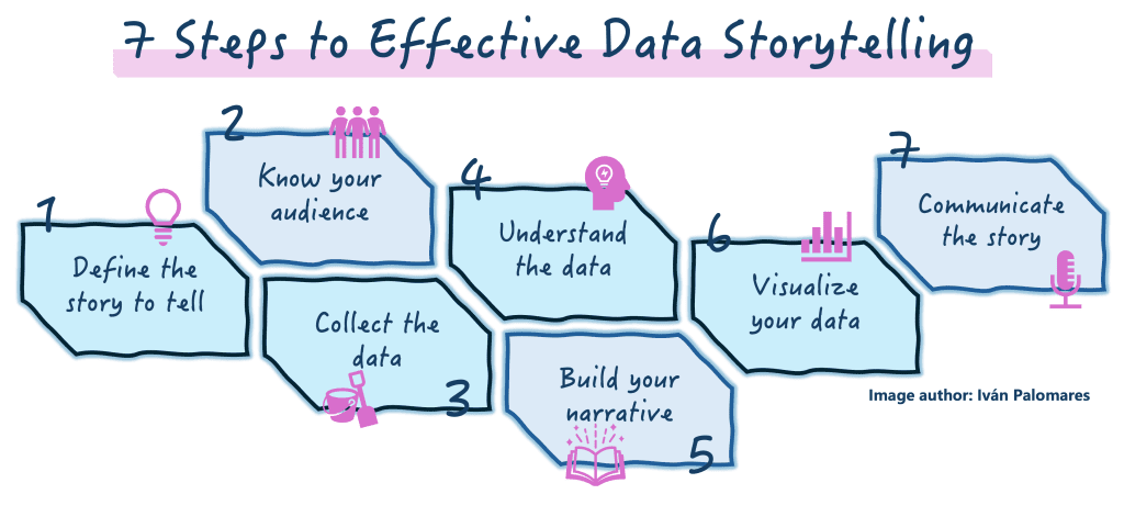
There is no unique way to perform data storytelling, but the following steps constitute a recipe that, if followed sequentially, will maximize the chances of successfully telling an insightful, engaging, and convincing story around your data.

Image by Author
Step 1: Define the Story You Want to Tell
This step lays the foundation for a compelling data story. Start by determining the key message to be conveyed through your data. Identify the main insights you want your audience to grasp, and a clear direction leading towards them.
Suppose you’re analyzing sales data for a fashion retail firm. The intention of your story might be defined as showing seasonal trends and highlighting peak periods. This clear definition will help you extract insights into how different seasons impact sales and develop marketing strategies accordingly.
Step 2: Know Your Audience
Understanding who your audience is, and what their background, interests, and motivations to listen to you are, is essential in crafting a compelling data story tailored to them.
For instance, for the fashion retail sales story, your audience may include the firm’s executive and marketing departments, who need insights on sales to optimize promotional campaigns and stock inventory. This profiling exercise helps you determine the right actionable insights and adapt the language used around data to make it relevant and accessible for decision-makers.
Step 3: Collect the Appropriate Data
Ensure you collect the necessary data for your story accurately and comprehensively, capturing all necessary details to align with its objectives and support your narrative. Collected data should be relevant, reliable, and sufficient to underpin your key message.
Gathering sales data from the past four years, categorized by season, product category, and location, could help find insightful sales patterns, thereby supporting your intended narrative.
Step 4: Understand the Data
Analyze the collected data to reveal trends, such as sales peaks during holidays or beachwear spikes at the start of summer. Identify anomalies like unexpected sales drops, and compare monthly sales across the years. This analytical process is vital to highlight critical insights, for instance finding out the best times for launching certain promotional campaigns.
Step 5: Build Your Narrative
Did your analysis uncover interesting facts about seasonal sales trends? Then it’s time to craft a solid narrative around them. This is a critical step where you are highly encouraged to tick some boxes for structuring an engaging and informative story:
- Introduce the context, highlighting important facts underlying the data, e.g. describing the importance of understanding fluctuations in sales
- Highlight key elements or actors involved in the phenomena described, such as best-selling products and stores
- Describe the challenge found -for instance, inconsistent monthly sales or unexpected drops- and propose solutions like targeted campaigns in critical periods.
Step 6: Visualize Your Data
No proper data story is delivered without visual support through data visualizations. Identify the right chart types to visualize facts or properties around your data: line charts to display sales trends over time, bar graphs to compare sales across product categories, or heat maps to point out top-sales locations.
Visuals are the soul of a data story: making complex data easily understandable, and positively impacting your audience by helping them grasp the key insights intended to convey.
Step 7: Communicate the Story to Your Audience
Finally, it’s time to present your data story to your audience, through a comprehensive report and an interactive dashboard containing the visualizations made in step 6.
Remember to revisit step 2 here (know your audience) and use clear, concise language, tailoring your presentations to their needs and emphasizing actionable insights.
In the fashion retail scenario, you may want to conclude by outlining strategies to leverage peak sales periods and address unexpected sales drops. This way, your audience will leave the room feeling empowered to enhance their marketing and sales strategy efforts based on the insights you just delivered to them!
Wrapping Up
By implementing these seven steps to craft a compelling data story, you’ll be able to turn raw data into insightful stories that drive engagement, empower your audience to make informed decisions, and ultimately lead to successful outcomes.
Iván Palomares Carrascosa is a leader, writer, speaker, and adviser in AI, machine learning, deep learning & LLMs. He trains and guides others in harnessing AI in the real world.

